ESPRESSO & EXPRESSIONS COLLECTIVE SKILLS TRAINING
about
August 2025
Espresso & Expressions is a Dubai-based collective focused on language learning and professional skills training. As the organization grew, its brand struggled to reflect the depth of its mission. What began as a coffee-inspired concept had evolved into something much more meaningful: a place where conversation creates opportunity.
The challenge was not to abandon the warmth of the brand’s name, but to reposition it. Coffee would remain part of the experience. The brand itself would focus on connection, growth, and collective momentum.
services provided
research brand strategy identity system brand identity brand refresh collateral & go-to-market design design frameworks & systems graphic design & production social media design system website design
creative opportunity
The original identity leans heavily into café culture. While approachable, it limits the company’s credibility as a serious training organization.
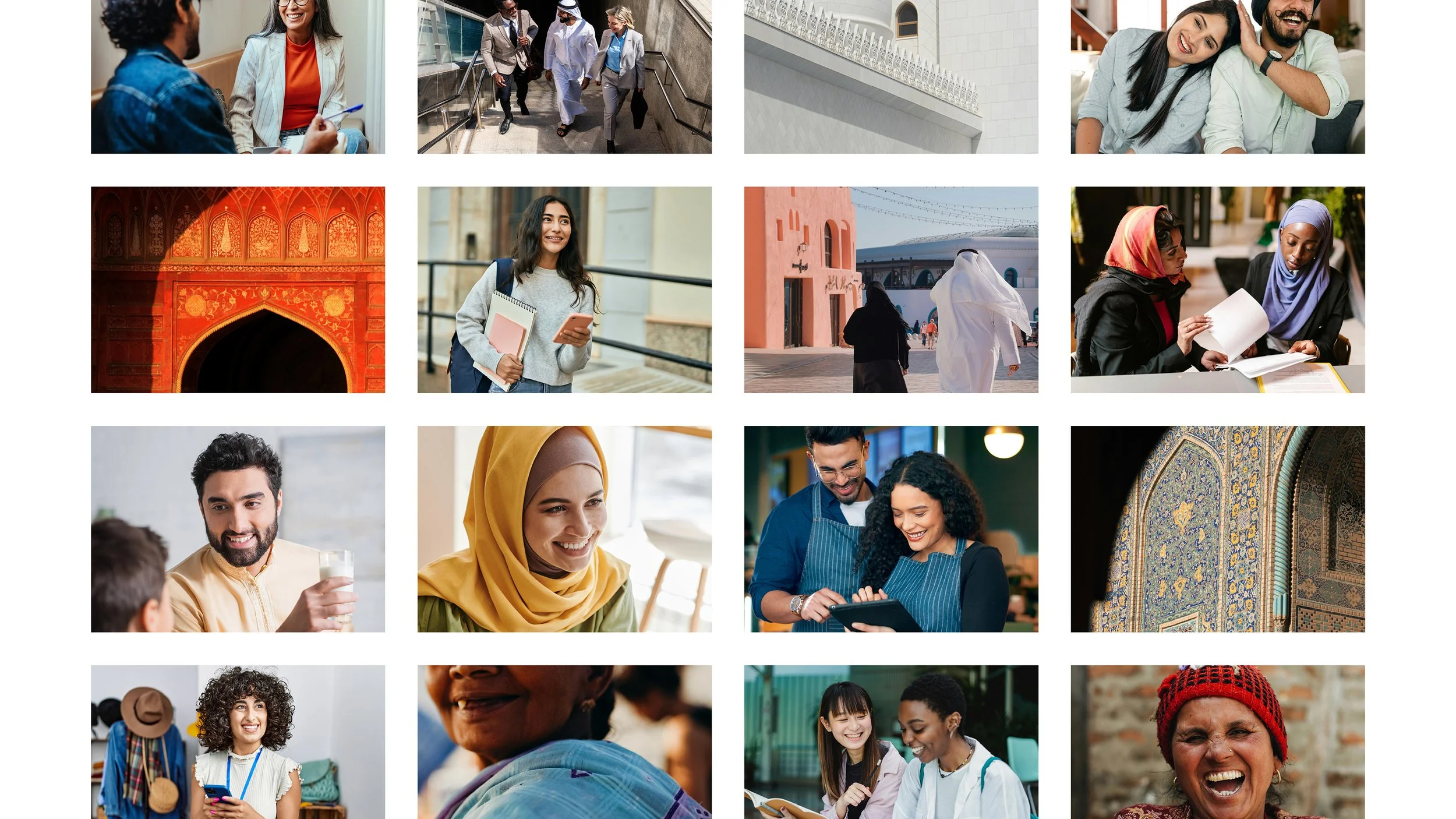
Dubai’s workforce is one of the most diverse in the world. Professionals arrive from every corner of the globe with one shared challenge: communication. The brand needs to reflect the reality of what Espresso & Expressions actually provides: a space where language becomes access to career advancement, cultural belonging, and confidence.
The repositioning frames espresso as a symbol of energy and conversation rather than the core offering. The focus shifts toward collective skills training and the power of communication to open doors.
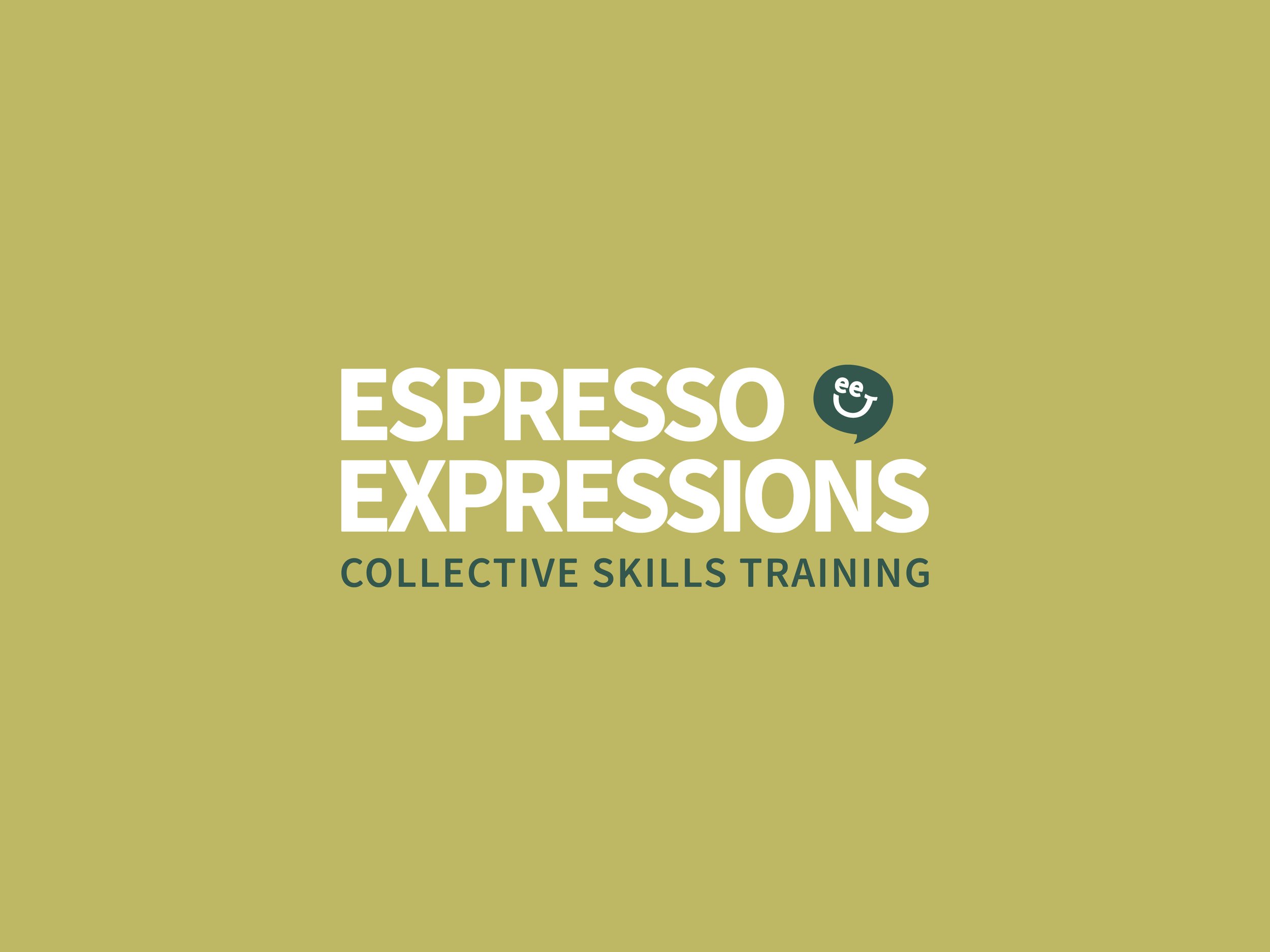
a mark built around conversation
The visual identity pairs a confident wordmark with a simplified speech bubble that reflects the brand’s focus on communication and human connection.
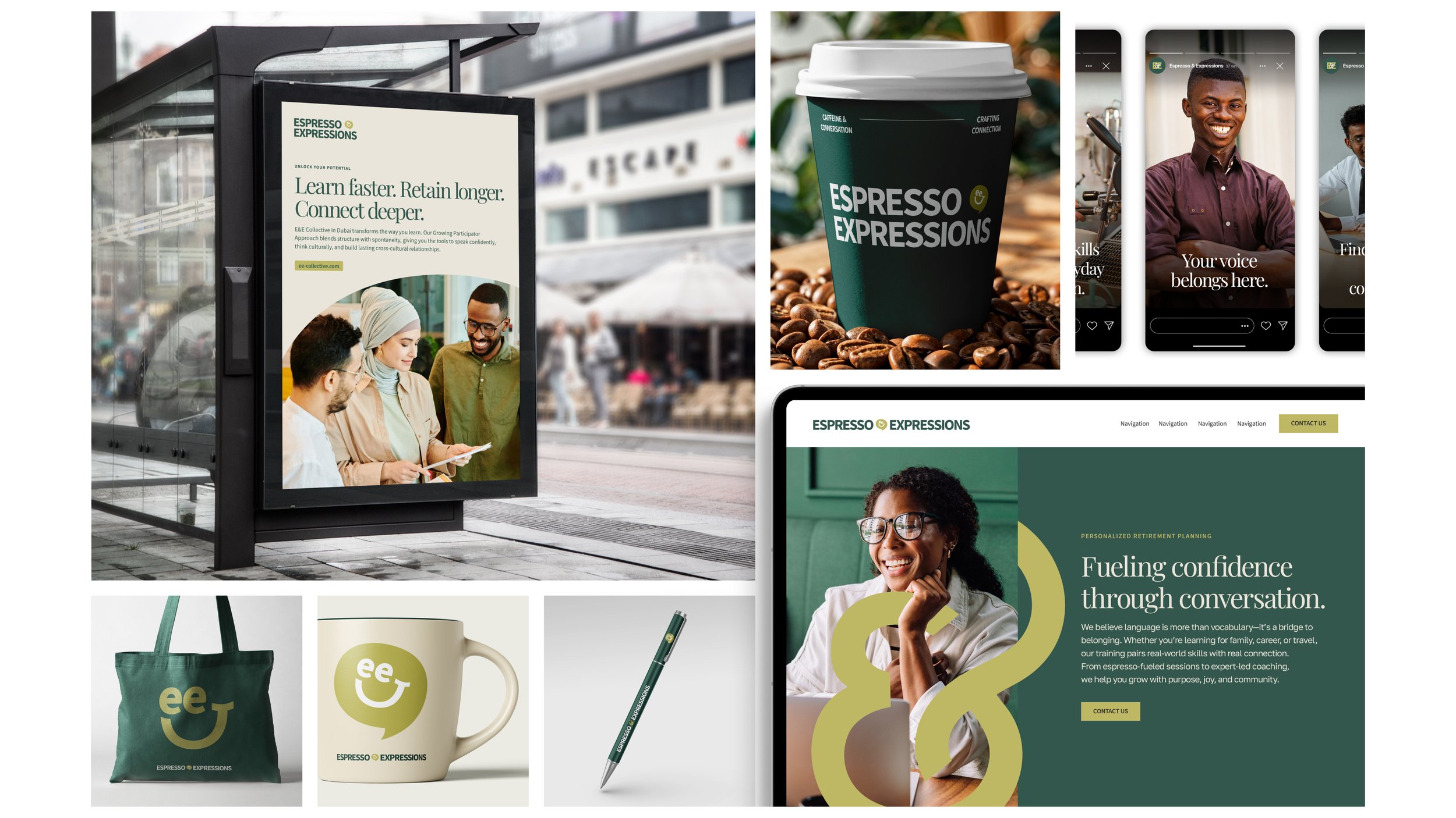
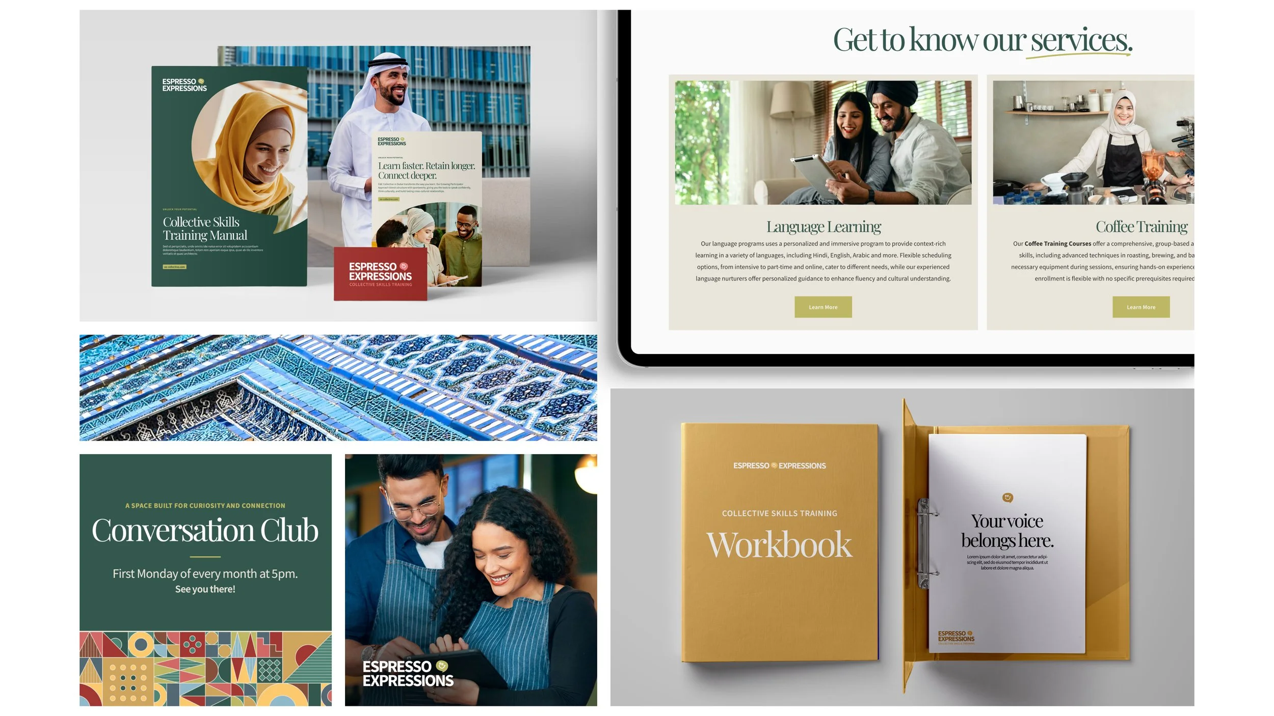
The system was designed to feel structured without becoming rigid. Clear spacing, alignment, and placement rules ensure consistency across digital and physical environments while allowing the identity to adapt to different formats.
At its core, the mark reflects a simple idea. Growth begins with conversation.
color grounded in place
Dubai is a city defined by contrast. Modern architecture, and global cultures intersect in ways that feel both bold and refined.
The color palette draws from that environment. Deep malachite and charcoal establish credibility and structure. Warmer tones introduce optimism and movement.
Tone-on-tone color usage allows the system to feel layered and dimensional rather than decorative.
typography balances clarity and confidence
The primary serif font (Playfair Display) anchors the brand’s voice with an editorial tone that feels established and intentional. It gives key messages a sense of authority without feeling formal.
The secondary sans serif font (Source Sans Variable) provides clarity across instructional materials, digital platforms, and marketing communications. The combination ensures the brand communicates with confidence while remaining accessible.
a human-centered visual language
Photography highlights authentic interaction across cultures. Natural light, architectural textures, and candid moments reinforce the idea that language learning is inherently relational.
The imagery reflects a community of people moving forward together.
built to scale
The resulting brand system extends across website design, signage, editorial materials, advertising, and environmental applications.
More importantly, it provides Espresso & Expressions with a framework for growth. One that allows the organization to expand its programs while maintaining a clear and consistent identity.
You might also like…


